A little bit late on this #artstationrecap2021 & general year recap! I have been preoccupied with a research Dissertation project, that's due in a few days time for the University of Central Lancashire MA Course in #computergamesdesign.
On reflection, it's been a tough productive year with many highs and lows. Lows, leaving some incredible people and colleagues behind. Highs, progressing with my personal career and ambitions as well as being welcomed into a new awesome team at Staffordshire University. I am personally excited to see what the new year brings and cannot wait to get back to it!
Personal thanks to everyone who has continued to support, mentor and be a friend to me, you all know who you are, I cannot thank you enough!
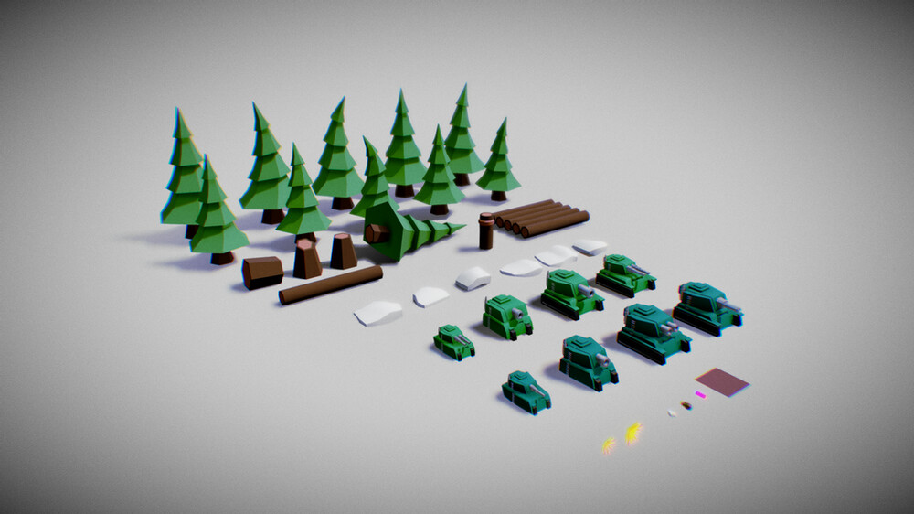
Low poly modelling is something that has become a style of its own over recent years. At first, models had to have lower polygon counts due to the limitations in hardware. However, hardware has now advanced well beyond those years, and video games can utilise a large number of polygons creating amazing graphical content with higher resolution textures and advanced shading such as raytracing. Despite all the advancements in tech, there has been a growing art movement which aims to keep things simple.
Low poly has become a term used to describe an art style/movement within video games design. But what is low poly and how do we define it? The words "low poly" could be applied to almost any style that seeks to decrease the number of polygons in a given mesh. You might be thinking if there is a mesh count classification list to help determine whether or not something is low poly, well there's not.
So how do we, as designers, describe a low poly style? It could be said that "low poly" is a deliberate choice to use a decreased number of polygons within a model(s) for a video game, despite having capable hardware that can handle higher resolution mesh types. However, it is not just the poly count that defines the low poly style; for instance, hand-painted models genuinely use a smaller number of polygons but do not fit the term low poly. Therefore the low poly style is about the aesthetical quality of the model. And how well it can exhibit a minimalistic poly count. While still retaining the overall visual representation of an intended design. For a low poly style to be effective; the designer has to utilise topology, lighting, post-process and material creation to produce an outcome effectively. Next question, does a model rely need to be low poly, to fall under the umbrella of the low poly art/design? Well technically no, it does not. To be clear, it is as much about the aesthetics as it is about the overall polycount. Some artist might opt to use more chamfers and smooths within there work. However, as long as the final results look as if the model is indeed low poly then who is to say that it does not fit the style?
There are a variety of different modelling methods that can be used when creating models for low poly style products. Within the first example images, you can see how the tank has been created using hard surface modelling techniques combined with post-processing effects. This gives a very clean and polished look overall while still keeping the actual modelling detailed minimalistic. However, It is important to note that post-process effects are not a requirement needed to fit the style and more of an in house decision.
Another common practice you might see when looking into low poly style is triangulated mesh types. As you can see in the example image above, this modelling method enables the designer to create added triangulated detail, which when combined with materials and rendering capabilities gives a nice triangulated low poly look. However, this style could be difficult to animate if done on a character unless using a custom shader that produced such effects.
There are many video games that are now using the low poly art style to great effect. It is interesting to note that while these products fall under the umbrella of low poly there products can be very different, as shown in the examples below.
The first example is planetary annihilation which combines some great model designs, colour palettes, rendering, and post-processing effects to create an immersive fun looking game.
Another video game that has used the low poly style to great effect is Tome Raider Go. This game makes use of some great camera views combine with neat models and simplistic colour palettes, whilst using simple lighting. You could even argue that there is an element or influences of cel-shading in there.
Low poly tends to be influenced by old retro type games, combined with modern-day rendering capabilities and hardware. Having stated that there are clear influences from isometric art styles and others within many low poly works. In conclusion, the "low poly style", combines the advancements in real-time rendering and expert knowledge of 3D modelling to produce a very creative and fun looking style that is flexible for designers to adapt and change depending on the desired outcome.
Visual style refers to the visual elements of a game and can be broken down into more detailed areas such as abstract, photographic and symbolic. This blog post will focus on the symbolic aspects of games and how there meaning is determined in relation to our culture and society. If you have not already looked then check out the other blog post on abstract and photographic.
Symbolic images focus entirely on the communication of meaning through visual symbols. At an extreme level, letters and numbers can be considered symbols that infer clear meanings…There is a theoretical hypothesis called Semiotic Analysis that attempts to explain the definitions given to certain signs and symbols based upon behaviour, language and culture. In relation to games, these theories are important to us as because they expose how a sign or symbol communicates its meaning.
Monopoly is a classic board game that has sold an estimated 275 million copies, in around 114 countries. But have you ever thought about its connection to our culture and society and why it is so playable? let's analyse the signs and symbols used within Monopoly, by exploring the wider connection to our society and culture. Remember that at an extreme level, letters and numbers can be considered symbols that infer clear meanings.
jail tile, ignore the text and look at the colours being used. In the United States, prison uniforms are often a distinctive orange colour with a white t-shirt worn underneath, this makes the prisoners more identifiable should they try to escape. Monopoly was first produced in the United States and has many cultural connections to it, that can be seen throughout the game.
Go to jail tile, again ignoring the text you can see that the image depicts a male in a navy blue uniform. Navy blue is known to symbolise importance, confidence, power, authority and is often the uniform colour of many enforcement agencies throughout the world. In addition to the uniform, the male is pointing while blowing a whistle, reinforcing that authoritative look and meaning.
Community chest tile, The community chest tile is an interesting tile, the chest represents the text perfectly but there is a deeper meaning behind the chest. A community chest also commonly referred to as community trusts or funds, help raise money from a particular community for the purpose of charitable giving. ,The first Community Chest, "Community Fund", was founded in 1913 in Cleveland, Ohio.
Now let's consider the overall tile locations, events and timings of them, in relation to our own society and culture. Looking at the board, how do you think the game is reflective of our society and culture?
There are many factors to consider when analysing a game like Monopoly, here are a few observations that you might agree or disagree with:
Estates or housing areas are segregated by economy “class”...in some cases, the super-rich, are a street away from the poor, for example, Old Kent Street and Mayfair.
The Jail tile is located in the poorest area of the board whereas the police guard tile is placed in the wealthier area of the board, the jail and police tiles sit diagonally opposite each other, highlighting the connection between them.
The movement of the game pieces are clockwise, relating to the passing of time, this again could relate to monthly or a weekly calendar.
Passing the GO tile rewards the player with pay. Pay comes at regular intervals regardless of how you perform...this could relate to a monthly or weekly income which is probably salary based.
The income tax tile is soon after the pay/GO tile - suggesting that tax is one of the first drains on your income. We all pay taxation when we receive our wages in real life, however, in the game some players may avoid paying tax, this could also be true within our own society.
The super tax tile is located in the richest area of the board, there are often huge debates on tax within our own society relating to many aspects of wealth or company profits.
There is a limited amount of land that is available for purchase within the game, this pushes the tile prices up, which is the same in real life, the less of something there is the more valuable it tends to be.
The cost of land depends on the area you are buying it in, again this is reflected within our own society as certain areas are worth considerably more, meaning only the super-rich can afford to purchase them.
Understanding the use of signs and symbols is very important to a designer if you want to create a product that players connect too and understand easily. This blog post, hopefully, has provided you with a broader understanding of signs and symbolism used within games.
If you have not played tank arena download it for free from the games section of this website, the game is a 2D wave shooter in which you much destroy as many enemy tanks as possible to beat your high score, however, there are no health refills so once you take damage you keep it.
The Design
Tank arena has a relatively simple design, it is a wave spawning game in which the player must destroy as many enemy tanks as possible in order to earn points and beat there or a friend's high score. It's designed to be played by a single player who will have to overcome wave after wave of enemy tanks that will damage and eventually destroy the player, which creates a loop or cycle of gameplay with the player being able to play another game of quite at the end of the round.
The Game Build
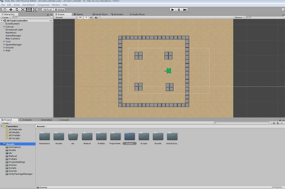
Unity game engine was used to build and develop the game, the game consisted of one scene with a predetermined starting location for the player (Indicated by the tank sprite).
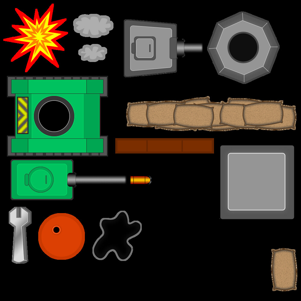
The 2D game assets were all developed using Adobe Photoshop then imported into unity. This sprite sheet was then divided up into the relevant sections needed for the individual graphics as shown in the image below.
Scripts
The game has around 11 scripts in total each controlling an individual aspect of the game whilst communicating or holding data for each other. In this section, I will explain how a few of these scripts work.
Camera Script
The camera controller script makes use of mathf.smoothDamp. This allows the camera to changes its direction gradually over time creating a drag effect, the target location is the player position in this case, which is continuously updating using the void FixedUpdate method.
Effects script
The Effects script controls how long the explosion mark sprite remains in the game space before being deleted. The script uses a simple if statement to calculate the amount of time remaining. The script also fades out the explosion mark using the objects alpha channel as shown in the image on the left.
Explosion Effect Script
This script makes use of the Destroy method which can either be used to destroy a particular object instantly or be used with a float value that acts as a count down timer before the method is called. Note that because this is a prefabricated game object, the keywords are used "This.gameObject" to ensure that it destroys this instance of the explosion effect in the scene.
Game Manager
The game manager script controls aspect of gameplay that relate to the stopping and starting of the game as well as keeping track and storing any changes to the high score. This script also controls the loading of menus such as start and quit game menu. The script makes use of unity game engines playerprefs which help create external files for storage of high scores.
Enemy Tank
The enemy tank script works based on a line of sight. The tank itself consists of two main parts, the tank turret and the tank shell. The tank turret tracks the players' position as soon as it is spawned into the scene, hence the turrets will always be looking towards the player. The movement of the tank is controlled by the tank shell, this works by detecting if the player is within a certain range. Depending on the range the enemy tank will either move towards the player who may be about the leave the enemy attack range or move away from the player if they get to close to the enemy tank. If the player is able to hide behind one of the blocks in the game then the enemy tank will no longer have a positive line of sight on the player and therefor will stop moving and stop firing. The script makes use of raycasting to achieve some of the effects.
The Player Controller
The tank controller has two parts similar to the enemy tanks. the turret game object tracks the mouse position, which is then converted into a screen point using Camera.WorldToScreenPoint. The tank body or shell makes use of the horizontal and vertical input keys to control and rotate towards the direction of movement.
Within video games design there are many terms used to describe aspects of video games such as theme, style, genre, gameplay and many more, this blog post aims to explain and explore the terminology associated with the visual style, focussing on the use of abstract images within video games. However, what is visual style and how do we as designers break it down?
Firstly let's define what visual style is...
It's clear that visual style represents the visual aspects of a video game and these aspects can be broken down into more detailed areas such as the game world and components that enhancing game play and emursion. Through visual style we can recognise the familiarity of a character or object and that they exist in different visual storyworlds. We could for example recognise a character from a particular franchise if it was presented in an appropriate visual way...
Visual style can be further broken down into more detailed areas such as abstract,photographic and symbolic. As stated in the opening paragraph this blog post will focus on the use of abstract images within videos games, using the classic Space Invaders to explain how abstract images work and hopefully help provide a framework you could use in the analysis of your own products or others.
Let's start with a bit of background information on Space Invaders. Space Invaders was developed by Tomohiro Nishikado, and released to the public in 1978. It was one of the first-ever shoot em ups and also had some interesting features, such as the first-ever dissolving barriers and the increased speed over time. The increase in speed over time utilised the limitations of the hardware, as the enemies decrease in the game, it lessened the strain on the CPU allowing faster load speeds which enabled the increased speed mechanic.
Ok, enough history, let us define Abstract, the term in this instance means existing in thought or as an idea but not having a physical or concrete existence. But how does this apply to video games?
Within the example image above we can see that the enemies are made up of abstract images that consist entirely of the ,visual elements, such as, lines, shapes, and colours. At the abstract extreme, these elements are neither arranged to produce a higher-level depiction of reality nor combined to communicate any clear or coherent meaning and instead relies on our interpretations, which are influenced by our personal experiences, culture, society and many other factors.
One of the reasons Space invaders, in its limited abstract form works, is because the images are unfamiliar to us, therefore we are left to interpret there meaning and as humans, we generally fear the unknown or make negative assumptions about unfamiliar situations. ",This type of fear is completely innate. It is a part of our genetic composition, it is not something we will never be able to control".Remember space invaders was one of the first-ever shoot em ups, and was, arguably one of the first games to actually intimidate players.
Space invaders use of abstract images have little meaning to them other than what we perceive them to be, therefor our minds seek out information that is not there, this is a form of apophenia which is the human tendency to seek patterns in random information and is something games designers can make use of within there own products. In the example image, you can see how the arrangement of the lights on the car or eggs, makes a face, which is not actually there, it's just our minds seeking out information.
The desired assumption for abstract images can be reinforced through other methods such as game text, colour, music, cover artwork and much more giving us a preemptive assumption about the game. In the example images above you can see how I have applied different colour and text to indicate a different meaning for the abstract images and hopefully a different interpretation to the player.
Space Invaders also conveys an enemy force because the game sprites are arranged in such a way as to form a formation. Rows and columns alined are used to present a unified force… Again as a designer, you need to utilise human perception, Gestalt laws of perception, are a set of rules, that describe how the human eye perceives visual elements and are usually used within the study of HCI. In our case space invaders utilities the law of proximity which states that objects that are near or 'proximate' to each other tend to be grouped together and the Law of Similarity which states that elements that are similar to each other tend to be perceived as a unified group.
In addition to the formation, the abstract shapes move towards the player maintaining there formation and speed. Motion perception is the process of inferring the speed and direction of elements in a scene based on visual input, again this helps reinforce your perceptions of the abstract shapes. helping to reinforce the idea that an enemy force is moving towards the player in unification.
Another good feature to influence the player's perception of game sprites is the use of colour, within the game the player's character is a very bright green and in many cultures around the world green symbolises, life, renewal, and nature, in this game you are supposed to be defending earth from an alien attack so what better colour to chose for the character than green?
We have summarised the term abstract within the visual style and looked at different ways abstract images can be used within video games, look out for other blog posts on photorealism and symbolism within video games.
This game was develop as part of my foundation degree. I tried to create a first person shooter using CryENGINE building many of the assets in it as well as using some of the default engine assets to help fill the scene and create the enemy AI.
Overall the engine was good to use and has some amazing render aspects and graphics capabilities as well as very good use of bump map shaders, and other texture related stuff.