Composition Breakdown for Webley & Scott Signal Flare Pistol

Tutorial / 19 May 2025

Mastering composition for hard surface objects—or 3D work in general—can be particularly challenging due to the complexities of shape language in this field. In this blog post, I’ll be sharing some of my recent compositional studies from a personal development project focused on the Webley & Scott Signal Flare Pistol.

If you're not familiar with the Webley & Scott Signal Flare Pistol, it’s a military signaling device developed for use during World War II. Manufactured in Birmingham, United Kingdom, the pistol features a self-cocking mechanism and was often equipped with barrel extenders to enhance its signaling capabilities.

One of the most challenging aspects of composition is understanding how to divide the frame to establish strong focal points and effectively guide the viewer’s eye across the canvas. In the following section, I’ll walk you through some of the techniques I explored to make my renders more visually appealing and engaging.

In the first composition shot, I chose to divide the frame diagonally—a decision influenced by the weapon’s form and my intention to showcase the entire model in a single render. This diagonal split provided a simple yet effective structure, offering both balance and directionality to the composition. I aimed to establish a clear point of interest through a combination of the text details and lighting choices. Subtle but deliberate lighting was used to emphasize the stamped text detail; it doesn't need to be overly intense—just enough to reinforce the visual focus. The diagonal approach not only supports the full presentation of the weapon but also contributes to a dynamic and well-balanced overall layout.


Example two features a more complex arrangement in terms of object placement and compositional structure. In this shot, the frame is divided vertically, with the larger shapes—namely the main weapon components—positioned on either side. To visually connect both sides of the composition and unify the larger forms, I introduced smaller objects between them. These elements act as a visual bridge, helping to guide the viewer’s eye across the scene and maintain coherence throughout the layout. I also positioned the trigger housing on a purposeful tilt to further guide the viewer’s eye toward the main barrel, using its straight edges as directional cues.


In the third example, the frame is divided into three distinct sections—an arrangement not far from a golden ratio split. The larger section on the right is designed to establish a point of interest through stamped text, supported by a soft light source to subtly draw attention. The middle division features the smallest component, the spring, which serves to guide the viewer’s eye across to the sight rail positioned in the third section. The elements are angled intentionally to create a visual loop, helping to maintain flow and deliver a composition that is both cohesive and aesthetically pleasing.

The fourth image makes use of the depth of the field to create a visual frame around the centre of the model. The composition is divided both horizontally and vertically, with balance achieved through the placement of the screws. A slight offset in the horizontal elements was introduced to break the uniformity and maintain visual interest throughout the piece.


If you’d like to learn more about the project and see some of the compositional breakdowns in action, be sure to check out the video.

How to paint a cracked floor tile using Photoshop

Tutorial / 07 October 2019

This blog post shows and describes the step by step process you can use to paint a cracked floor tile using Photoshop. The tutorial assumes you are knowledgeable about Photoshop and are familiar with its tools.

1: In the first step, use a hard brush with the brush pressure, and size sensitivity turned on to create an outline of a cracked tile.

2: Choose a colour to use as your colour base and colour in the surface area, do not apply any shading at this stage. Its recommended that you work from dark to light.

3: Pick out a verity of different colours that you can use to build up detail, also make sure the opacity sensitivity is turned on to created different colour tones and hues.

4: Using a hard brush and the colour sample tool blend in the different colours to create a stone surface area, this helps to create surface detail.

5: Now use a soft brush to create a smoother transition between the colours, make sure you use the colour sample tool and turn on the brush pressure settings.

6: Now using a hard brush with the size sensitivity and pen pressure tools turned on, reworked the lines. Make the brush larger than the original linework to help create depth.

7: Finally add some highlights and retouch the linework if needed, use a hard brush for this with the size sensitivity turned on.

Optional 1: You can add extra surface detail at this stage. However, this step is not needed if you are happy with the design.

Optional 2: You could also add in extra filters to created added detail; in this image, the grain filters have helped add additional surface detail. But again this is optional.

Video Game Interface Types

Tutorial / 03 October 2019

Continuing on from the last blog post this one will discuss some of the different types of interfaces used within video games and how we can correctly describe them. If you have not read the previous article then it might be worth a read before you indulge yourself on this one.

Different types of interfaces are used within video games for a verity of different reasons, some are used to provide the player with statistics or locations which they must travel to, others are actually in the game world and can only be interacted with via the player's characters. Each of these interface types can be categorised into one of the following Diegetic, Non-Diegetic, Spatial, Meta interfaces.

Diegetic Interface Types

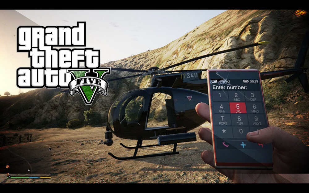
A diegetic interface is an interface that is included within the game world, this means that players can interact with them via there characters. It also means that the player's character can hear and see them within the game world. These types of interfaces really help with player immersion as they often have to interact with them via there characters. GTA is a good example of a diegetic interface as the player can only interact with the device via the character to perform different actions that relate to gameplay. There are plenty of other games that use this type of interface really well such as Aliens isolation in which the player uses a verity of in-game devices to perform various actions.

Take the radar, for instance, it does not take any direct input from the player's character but does take input from external sources which are used to then output information to the player, this information can only be view in the game when the player's character is holding the device.

Non-Diegetic Interfaces

Non-diegetic interfaces are the opposite of diegetic meaning they do not exist within the game world and are no interactable via the player's character. These are typically what would make up for heads up display (HUD). Most games will need to communicate to the player various statistics such as speed, health, map location or mission objectives. The HUD's allow for this and more to be presented in a compact and efficient way.

However, there are game HUDS that are an exception to this such as the world of Warcraft, which uses a very complex HUD. To see why this HUD works and does not overwhelm the player check out the previous article.

Spatial

Spatial interfaces like diegetic interfaces in some respect because they are present within the game world, however they are not intractable. they often are used to help the player see hidden objectives or areas of importance. Sims is a good example of a game that uses a spatial interface very well to help show to the player preferred action of there characters.

Meta interfaces

Meta interface are representations and unlike spatial interfaces are not recognised spatially, They are often used for effects such as taking damage or possibly to indicate a characters speed. Many FPS game will make good use of meta interfaces such as Doom or Call of duty.

Conclusions

You have probably realised by now that video games will often make use of more than one type of interface to ensure the players are able to interact with it effectively. If you are still unsure about the type of interface you might be designing or making you can use the chart to identify which one it is.

Create a seamless brick texture in photoshop

Tutorial / 03 October 2019

So what is a seamless texture and how important is to have the skills to create them? A seamless texture is an image that can be placed next to one another creating the effect of a continues pattern. The skill of creating these images is a handy tool to have in your bag of tricks, either for a developer who needs to add some jazz to there prototype or a game artist building complex environments.

In the example image, you can see a seamless texture with the size 2048 x 2048 pixels. At the top of this image is an example of the image unconnected to one another.

When placed next to each other you can see that the pattern or image continues with no break along the aliened edge.

In video games, this helps create detailed environments that compress aspects of the game down into more manageable file sizes.

Over the years the way we can create textures has adapted and become more mainstream with programs like Zbrush and substance painter/designer offering real-time environments in which these images can be created. However, there are a verity of ways to create these textures so if you do not have access to ZBrush or substance painter the methods and techniques shown in this video can be applied to a number of different software packages.

The video concentrates on creating a seamless brick texture which can be challenging for beginners.